
Live Nation: Streaming & Events Production Redesign Project
Client Background
Live Nation Entertainment (livenation.com) is an events promoter and venue operator company. Live Nation is the world’s leading live entertainment company that brings artists around the world to various live sets and festivals. They bring 40,000 shows and 100+ festivals to life, sell over 500 million tickets per year in 40 countries and over 200 various venues.
Project Overview
Business Challenge
Live Nation is the world’s leading live entertainment company that brings artists around the world to various live sets and festivals. However, in recent years, COVID-19 has left thousands of artists to cancel upcoming shows and festival appearances. Not to mention, millions of fans without live entertainment for months. Live Nation wants to establish user needs and increase the revenue and recover from the losses brought by the pandemic.
“Live music is the cure for what ails ya.”
— Henry Rollins

Project Scope
Mobile website redesign
Design Sprint
2 weeks (80 Hours)
My Role
UX Researcher (Competitive and Comparative Analysis, Affinity Mapping, Usability Test Synthesis, Design Brainstorming, Presentation Design)
Platform
Figma, Canva, Google Workspace, Paper App
Key Skills
Qualitative Research, Research Synthesis, Collaboration, Ideation, User Experience Design, Figma, Presentation
Research Methods
Competitive Analysis, User Interviews, Affinity Mapping, Persona Creation, Usability Test
Curious Space
What sparked my curiosity in this project is:
Why are people passionate about live performances?
What is it about live events that concertgoers love?
How has the pandemic changed the viewing habit of people who watch live performances?
Market Research
Competitive Analysis: Feature Inventory of Direct Competitors
We wanted to know what the industry standard and good practices are for live streaming and ticket-buying sites currently. So, I conducted a competitive analysis on Veeps and VLive which are direct competitors and are offering live streaming services, and Stubhub which is a direct competitor in ticketing services.
Competitive Analysis: Plus-Delta Analysis
I performed a plus-delta analysis on Veeps and Live Nation which gave us feedback and ideas for further improvements.

Key Takeaways
Feature Inventory
Industry-standard features live streaming sites have:
Live broadcasting
Video-on-demand feature
Ability to search and sort events to users’ preference
Plus-Delta Analysis
Through our plus-delta analysis, I have gathered some industry-standard good practices like:
Quick and easy check-out process and
Simple user interface to make the user flow smooth and intuitive

User Interviews
To get a good grasp of our users' needs, frustrations, and insights on the current live events experiences, we did a series of user interviews. We wanted to find out why they like going to live events and what made the experience pleasurable and what made them unpleasant.
Participants:
We gathered 4 interview participants who are fans of music and have a lot of experience attending live performances.
Key Takeaways:
All participants were open to live streaming shows and had experienced at least one during the COVID-19 pandemic.
All participants said that physical safety was a concern for them.
All participants expressed hesitation to go to live shows because of the COVID-19 pandemic.
All participants mentioned that they like going to live performances for the immersive experience.
“I did it a couple of times during the pandemic. I loved it honestly, I thought it was a totally unique experience”
“The AstroWorld thing really got me because it’s literally my experience in going to concerts when I am younger, it’s one of the scariest feelings in the world.”
“If I can dance and move my body that means I’m in it.”
“[The pandemic] made me realize how kind of just unpleasant being in a tight sweaty room with other people is.”

Affinity Mapping
Through an in-depth synthesis of our user interviews, I got a hefty amount of usable insights. I found that all of our participants expressed the following collective insights which prove to be compelling and useful.
Collective Insights:
I'm open to experiencing live shows remotely.
I need my live show experiences to be immersive.
I am concerned for my physical safety at live shows.

Problem Statement
In order to create effective solutions and clarify what the team is trying to solve, I formulated this problem statement based on the user’s needs and insights.
Users need an immersive way to experience live events without compromising their health and comfort.
how Might We
Based on the findings, I drafted a “How Might We” Statement to guide the team in the ideation of possible solutions to solve the users’ problems.
How might we provide immersive live experiences in a way that event attendees can mitigate risks?
Persona
To help the team focus to ideate user-centric solutions, A persona was developed from all the data collected from our user research.
Solution
Keeping our findings in mind, we determined that a good solution to the users’ problem is renting out Virtual Reality Technology for use in attending live events, allowing us to provide an immersive experience for the users and at the same time keep them safe and comfortable wherever they choose to view the live event from.

Ideation
Ideation Sketches
I conducted a time-boxed brainstorming activity to ideate design solutions. Here are some of my sketches:

Site Map
To help inform our design, of the new navigation system, we conducted a series of closed card sorting, to find out where users would intuitively place information provided found on the website. We used the data gathered from the card sorting and designed a new site map.

Mid- Fidelity Prototype
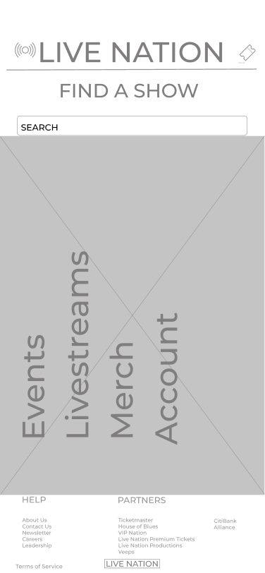
Landing Page
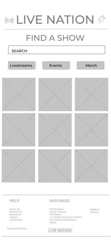
Product List Page
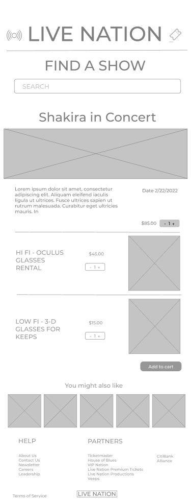
Product Page
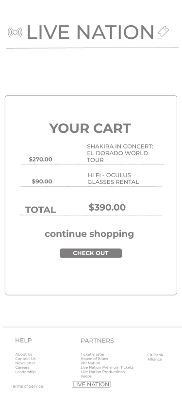
Cart
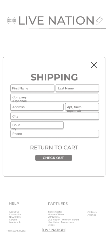
Check Out Page
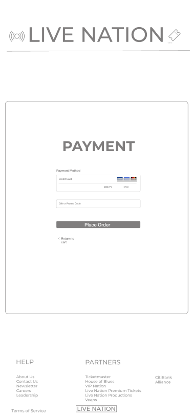
Payment
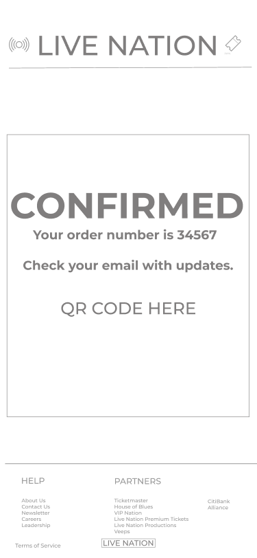
Order Confirmation

Mid-Fidelity Prototype Usability Test
A series of usability tests were conducted on the mid-fidelity prototype to test its functionality, intuitiveness of navigation, ease of task completion, and language.
Overview:
Participants: 3
Tasks:
Find a Shakira live stream concert.
Add one ticket to the live stream to your cart.
Add one pair of 3D glasses to your cart and proceed to check-out.
Key Takeaways:
After careful analysis of the user insights and observations, here are my findings:
It took an average of 17.7 seconds for users to look for the live stream they were asked to find
It took an average of 34.3 seconds for the users to complete the check-out process.
All participants completed the assigned tasks.
All the participants found the navigation intuitive and easy to use.
All participants expressed confusion because it seemed like there was already something in their cart.
Participants noticed that the product page looked like a cart.

Style Guide
I made a word cloud to find keywords that participants used to describe music and their live music experiences, combined with this data, a mood board and a style guide were created.
Keeping with the brand's existing color palette and changing the typography to Montserrat - we established a spontaneous, colorful look and feel to mirror the feeling of being at a show. While live events and street-style photography as inspirations for design elements.
Iterations
Based on the usability tests conducted, here are the prototype iterations that I recommended based on my findings:
Put more product details such as show description on the product page
Made sure that the quantity on the cart starts at "0"
Added cart icon and feedback notification to avoid further confusion

High Fidelity Prototype

High Fidelity Prototype Usability Test
A series of usability tests were conducted on the high-fidelity prototype to test the look and feel of the interface, ease of task completion, and language.
Overview:
Participants: 3
Tasks:
Find a Shakira live stream concert.
Add one ticket to the live stream to your cart.
Add one pair of 3D glasses to your cart and proceed to check-out.
Key Takeaways:
After careful analysis of the user insights and observations, here are my findings:
It took an average of 6.3 seconds for users to look for the live stream they were asked to find
It took an average of 29 seconds for the users to complete the check-out process.
Participants got confused with the CTA and suggested that buttons should look different if adding to the cart is disabled.
Participants mentioned that CTA copies on the checkout process were confusing.
Participants expressed that there should be an option to use the same information for billing and shipping.
Participants noted that they want the option to edit the quantity of tickets while in their cart

Final Iterations
Based on the usability tests conducted, here are the prototype iterations that I recommended based on my findings:
The product page was updated to show add-ons such as oculus glasses being clickable ONLY after a virtual reality ticket is first added to the cart.
Replaced "Checkout" with "Continue to Payment" for clarity that the users are moving forward to the next part of the process
Made the quantity in the cart editable
Replaced "Shipping" with "Checkout" on the CTA - so the users know that this is the start of the checkout process
Replaced "Buy" with "Complete Purchase" , to indicate that this is the final stage of the checkout process.
Next Steps
As for the further development of the product here are some of my recommended next steps:
A native mobile application
A built-out desktop experience for purchasing live streaming events and renting VR headsets.
Further research on developing user interactive VR experience

Impact:
Mobile device - through this research, I learned what devices users use for browsing and purchasing their tickets, so the team was able to design a better experience by catering to that need.
Immersive intimate experience - Another discovery that was gained through this research is that contrary to popular belief, avid fans of music go for the immersive and intimate experience of the artists they love, and the majority of them like going to concerts alone.
Adopting to the “new normal” - People have accepted the changes that the COVID 19 pandemic has brought. In the face of this transition, the research for this project has moved and driven this product to adapt to the new normal.


